
Popular instant messaging platform WhatsApp is continuing its ongoing effort to modernize its Android user interface. Following recent overhauls aimed at updating the app’s bottom navigation bar and bringing it closer to modern design standards, the Meta-owned service is now turning its attention to the core element of its user experience: the chat input bar.
Discovered in the WhatsApp beta for Android build 2.26.41.11, the company is actively developing a subtle yet meaningful redesign for the conversation screen. The update introduces a fresh layout for the text entry field, action icons, and the send button, aiming to deliver a more cohesive, modern, and visually balanced messaging environment. Although the new layout remains in active development and has not yet been enabled for general beta testers, early build details reveal a deliberate effort to make the chat bar more efficient, spacious, and responsive to user habits.
This potential interface update highlights how micro-interactions and small visual refinements play a vital role in high-volume applications. With billions of messages sent across the platform every day, even fractional adjustments to button placement, field height, or visual padding can noticeably alter the daily user experience for hundreds of millions of Android users worldwide.
WhatsApp Explores Dual Design Variants for Chat Interface
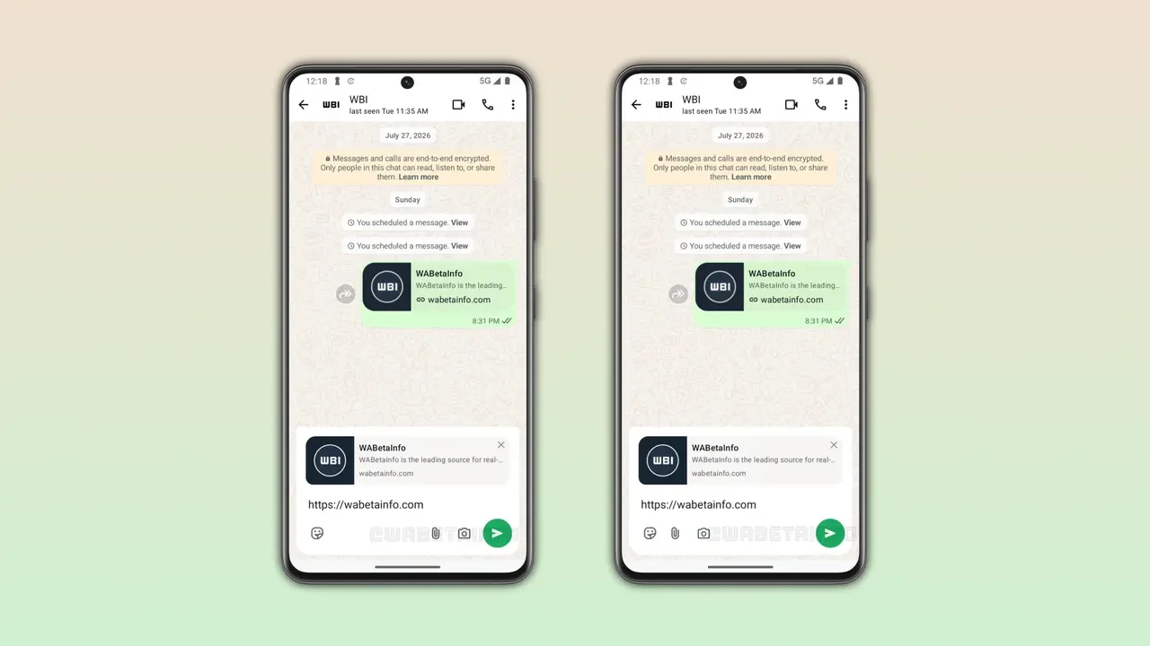
As part of its internal iteration process, WhatsApp is currently testing two distinct design variations for the updated chat bar. By evaluating two different layout configurations, the development team is seeking the optimal balance between usability, aesthetic minimalism, and functional accessibility.
The primary structural goal across both experimental designs is to integrate the send button and text input box into a single, unified visual element. In the current interface, the send button—which toggles between a microphone for voice notes and an arrow for text messages—sits outside the primary text box as a floating circular button. The new approach embeds these controls directly within the perimeter of the chat bar itself.
By enclosing the action buttons within the same structural container as the text entry field, WhatsApp reduces visual fragmentation at the bottom of the conversation window. This consolidation creates a cleaner line along the screen margin and establishes a clearer hierarchy between the message content area and the interaction bar.
The main differentiation between the two experimental variants lies in how the functional action icons—specifically the emoji picker, attachment clip, and camera shortcut—are distributed relative to the text entry space and the send button.

First Variant Maintains Familiarity While Optimizing Layout
The first design option under evaluation retains much of the spatial arrangement familiar to long-time Android users, while introducing smart optimizations to enhance comfort and efficiency during text entry.
In this initial configuration, the emoji selector button remains positioned on the right side of the main text field, preserving a quick-access touch target that users have relied on for years. Meanwhile, the attachment icon (represented by the standard paperclip) and the dedicated camera shortcut are positioned on the lower left side, situated adjacent to the integrated send button.
To accommodate this reorganized control layout without compromising touch accuracy, the text entry box itself is shifted upward within the bar’s container. This design shift effectively creates a expanded typing zone, offering a larger multi-line view when users compose longer messages.
By keeping familiar controls in roughly the same relative locations while cleaning up the visual boundaries, this first variant aims to minimize friction for existing users. It seeks to modernize the visual style of the application without disrupting the muscle memory that users have developed over years of daily interaction.
Second Variant Embraces a Minimalist Approach
The second design concept tested in the beta build takes a more decisive step toward visual minimalism by completely reorganizing the control placement to declutter the right side of the screen.
Under this second layout scheme, WhatsApp consolidates all auxiliary input tools onto the left side of the chat bar. The emoji selector, attachment icon, and camera button are grouped sequentially along the left edge, creating a unified tool bank for media and expressive inputs.
With all shortcut icons shifted to the left, the right side of the chat bar is dedicated exclusively to the send button. This arrangement eliminates visual clutter from the primary action zone, establishing a distinct visual separator between input shortcuts and the final message dispatch action.
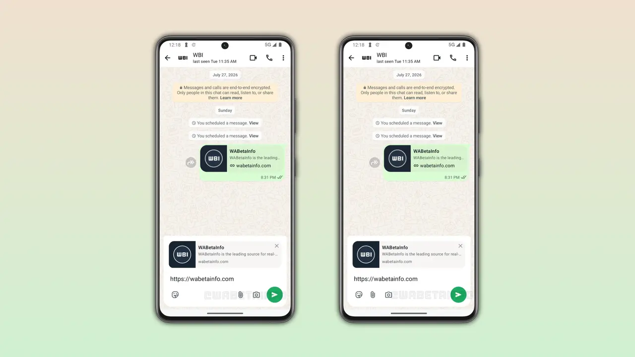
This streamlined layout offers noticeable ergonomic advantages, particularly for one-handed operation. By isolating the send button on the far right, users are less likely to accidentally trigger the camera or attachment menu when attempting to tap send with their right thumb. The clean, uncluttered right corner creates a spacious visual anchor that simplifies interaction during fast-paced text exchanges.
Development Stage and Strategic Rollout Considerations
At present, both chat bar designs are in the early stages of internal testing and development. Because the code remains hidden within the WhatsApp beta for Android version 2.26.41.11, the feature is not yet visible to standard beta testers, let alone the general public using stable release builds.
Meta frequently tests multiple interface variants simultaneously behind feature flags in its code base. This iterative development workflow allows engineers and designers to evaluate layout stability, test different screen resolution scales, and conduct internal A/B usability assessments before committing to a final release candidate.
This approach mirrors WhatsApp’s recent redesign of its main Android navigation bar. During that project, the platform tested several iterations of bottom navigation tabs over several months, making minor tweaks to spacing, iconography, and color palettes based on user testing before officially pushing the final design to stable channel users.
As development progresses on the chat bar, it remains possible that WhatsApp may further tweak these layouts, combine features from both variants, or adjust icon spacing based on telemetry and feedback. The company has not provided an official timeline for when beta testers will gain access to the feature, nor when the final design will reach global production channels. However, the presence of fully realized layout configurations in recent beta builds indicates that a broader public rollout of a modernized chat bar remains a key priority for WhatsApp’s Android development roadmap.